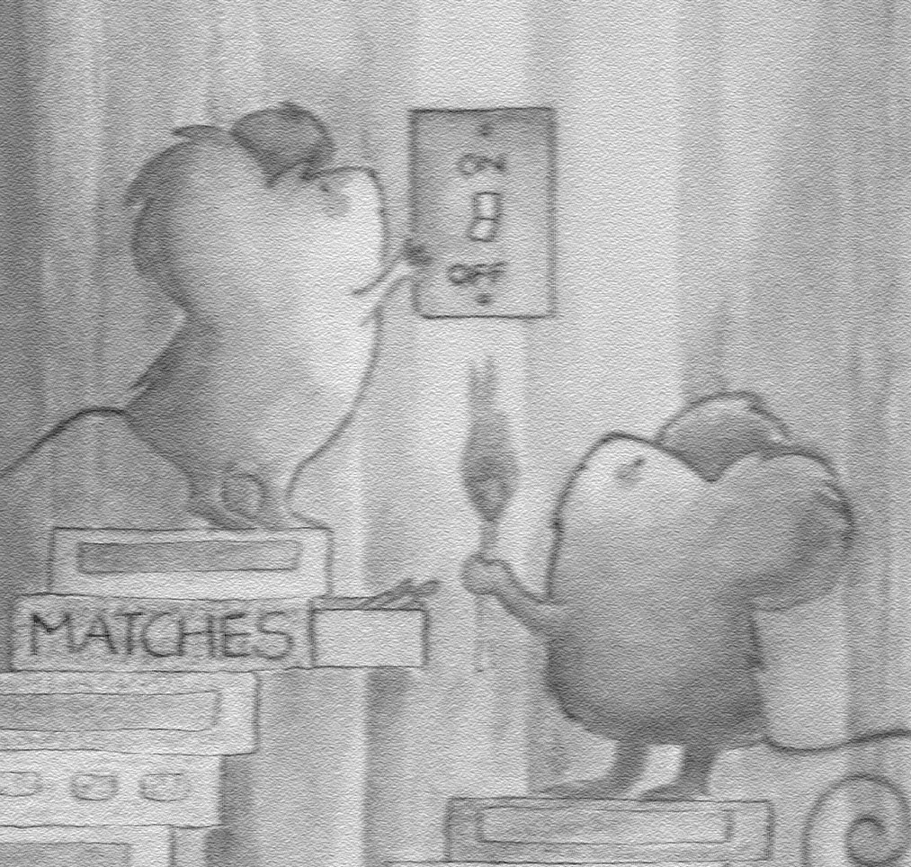
This week's IF submission. I was going for a dark look since the only light source is suppose to be the lit match. I think the piece works for this exercise. However, I am wondering if anyone has suggestions on how to more successfully portray a dark room and still make characters and overall scene pop.
8 comments:
This is very cute.
I think these little mice are soooo cute!
My thought on making the room look darker is to darken the outer edges so that it looks like the light from the match is creating a circular glow and then give the mice and other elements a cast shadow from the source of the light. That should make it pop.
Your drawing is so cute.
This is funtastic!
Cool illustration. I think you have the right idea just continue darkening more outside the glow of the match as Debra suggest. Then lighten everything on the edge facing the match glow. Anyway, love it fine as is but know what you mean.
Neil
yup indeed! Very cute
That's a nice drawing!
/M
This is adorable and a great idea! Love your illo.
Post a Comment